Thursday 11 October 2012

YouTube for iOS Review

Apple's most recent iOS 6, most notable for the seemingly "horrific" new Maps app (which we disagree with, right here), is doing away with any ties to Google. The YouTube app is gone (okay, I admit, that app was bad, very bad), but unlike Maps, nothing was left to fill the void. So Google came out and quickly rolled out its new and improved YouTube app.

The new YouTube app

How does it look?

After signing in with your Google account, you'll see typical Google. Very minimalistic, with a simple list of videos from your subscription box which sport huge icons along with a search button and sidebar. That's pretty much all there is. When watching a video, you can now view a video while reading the comments or description. Turning your device automatically hides the description and puts you in full screen mode. It works pretty much exactly how you expect, and in this regard, Google has done a great job.

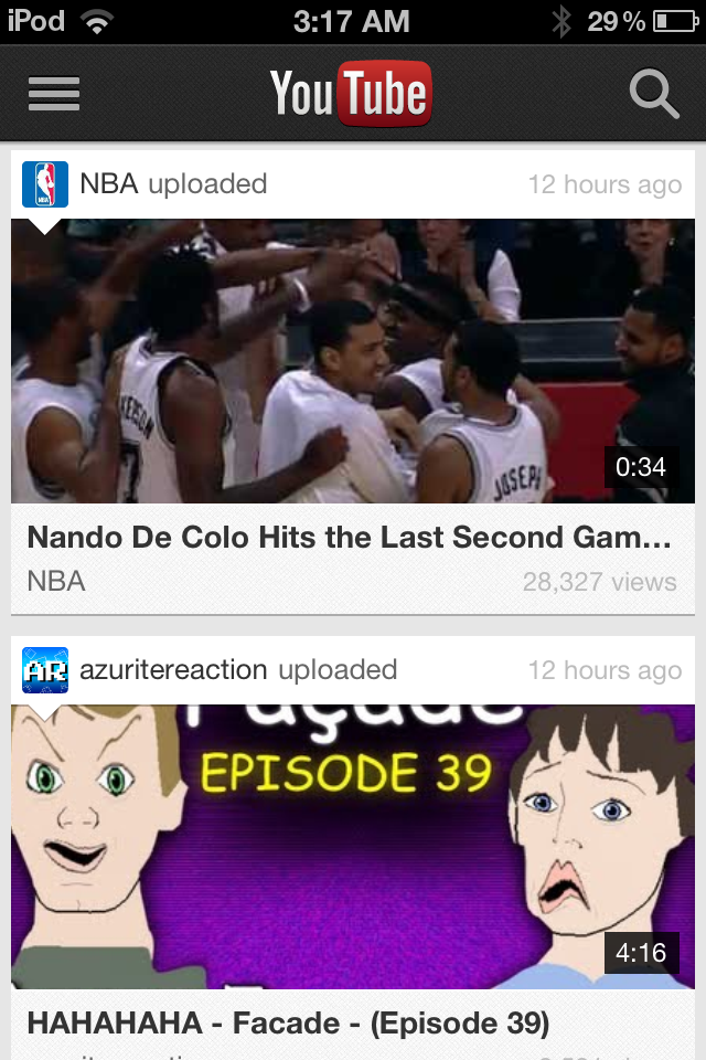
New YouTube App Subscriptions
Old YouTube App Subscriptions
New YouTube App Video
Old YouTube App Video (Hint: You can't
watch a video and read the
description at the same time


Performance

One thing that really bothered me to no end with Apple's Youtube app was that no matter how bad my connection speed was (and it's notoriously bad in my area), it insisted on playing the high quality video wherever possible. This meant that I couldn't watch a video without it constantly buffering, frustrating me to the point of giving up. Thankfully, Google's new YouTube app knows better than to download more than it can handle, and uses standard quality whenever connection speeds are slow.

Long way to go

Unfortunately, after the first few weeks, letting the excitement of the new app settle down, I've come to realize that all that praise ends there. Google has a long way to go with their YouTube app to be really killer. What about annotations? Back in 2007 when the original YouTube app was made, there were no annotations, and its understandable that they were never included back then. But there are a lot of YouTubers nowadays who make really high quality videos now and many like to include links in their videos for easy access. To those on mobile devices, there's absolutely no ways of seeing annotations. It's really a major let down for the YouTube addicted like myself.

Usability could also be improved as well. Categories are stored underneath subscriptions in the side bar. That's a huge mind blank by Google. What if I have 300 subscriptions? I'm going to scroll forever every time I want to choose a category. And those video icons. I initially thought I'd like the size, but they take up literally half the screen. That's not really surprising, because their desktop YouTube page is notorious for being very unorganized.

Conclusion

Don't confuse the fact that I spent half this review ranting about the new YouTube app. It works just fine and watching YouTube videos works just perfectly. It's just that YouTube has been around for the entire life of the iPhone, it's a little frustrating that their isn't a way of watching YouTube videos on a mobile device that feels like a pleasurable experience. But it's exactly what you expect, and it's definitely hands down better than Apple's five year old app. But personally, I'm going to stick with the mobile web app.

My Take on Windows 8

Windows 8: the new logo

Microsoft is putting the finishing touches on their 8th edition of the market-dominating Windows operating system. Although, this is arguably one of the most drastic overhauls of the operating system since first launch in the mid-90s. Microsoft is gearing Windows more towards touch screen devices - tablets, phones, touchscreen PCs - and the changes as a result of this are quite profound. 

Live Tiles are definitely a useful and intuitive tool with the countless notifications that one gets on a daily basis. The idea behind them its that each app has it's own tile, which displays the current status of that particular app. For example: the Facebook app would display the number of new messages, notifications, and friend requests on the tile itself, without the user having to open the app. Good idea, sure. But many have questioned Metro's (as Microsoft has colloquially called it) ability to successfully transfer over to the personal computer. I'll talk more about that later. 

Windows 8 Start Screen: replacing the Start Menu

The Start Screen is essentially a collection of live tiles, offering notifications from many different apps all in one place, much like Notification Centre in Apple's iOS and OS X. Microsoft has taken a very different approach to this, however. Rather than having a Start Menu, or Launchpad (like previous editions of Windows and current OS X versions), Microsoft has made the Notification Centre the only place to access applications, and other features that are part of the computer. Personally, I think this is a fantastic idea. Unfortunately, rather than only making this available for those using tablets, Microsoft has pushed this rather intuitive feature on to everyone using Windows 8. Not a bad idea, you might ask? Perhaps. However, with devices without touch screens (or 90% of the personal computer market (when I say computer, I mean notebook and desktop PCs, not iPads and tablets)), this installation does not work as one would desire. 

The Hot Corner to open the Start Screen


The Hot Corner-esque aspects of the OS make it difficult for users with keyboards and mice to navigate the system, with no constant markings on the screen as to how to get to the Start Screen, the user becomes confused, frustrated, and immediately dislikes the change. On tablets, it's a completely different story, with the user swiping from any side of the screen to get to these features, it definitely makes the OS seem responsive and like it was actually designed for touch screens. Which it was. It's just that the (forced) transition for notebook and desktop users seems like they've been given a unfinished and inadequate experience. 

Windows 8 Application Store


The Microsoft Application Store is a long overdue addition to Windows 8. Gone are the days where users had to search the internet for what they wanted, only to find thousands of matches, most of which was malware. The Application Store currently has about 4000 apps (that's before the actual launch of Windows 8). It's very similar to Apple's OS X App Store; every app needs to be verified by Microsoft, to ensure it has only good intent. Updates are easy, fast, and quite regular. 

Overall, Windows 8 is a wonder on tablets and other all-touchscreen devices. It's use on notebooks and desktops seems rather lacklustre and poorly implemented. Having said that, only the launch, sales figures and user satisfaction numbers can prove that point. It will be just as interesting to see the success of the Microsoft Surface. Without any solid reviews to base any critique this device on, it's made to look like it's the most amazing thing since the advent of the internet, which is exactly what Microsoft wants us to think. Having said that, it sure does look nice.

Microsoft's new tablet, dubbed the Microsoft Surface

Wednesday 10 October 2012

Polaroid Z2300


Positives:
Being a frequent user of Instagram, like many others, this new tech is extremely exciting as it portrays aspects similar Instagram in an almost instant physical form.
The Polaroid Z2300 is a 10 megapixel camera which includes a built in Zink printer which automatically print all images captured (2 x 3 inch full colour) within a minute.
A handy 3 inch display allows users to sort through and manage all photos captured and this pocket size device allows users to snap polaroid pictures wherever they wish. 
Finally, the device allows external memory cards to print photos from a different location which is useful as it allows for photos to be transferred and saved to different locations for more the excessive users which exceed the internal memory storage.


Negatives:
Negatives which may change my opinion when deciding the purchase this Polaroid are the fact that the Zink cartridges and paper will cost AU$24.99 for 30 sheets, which appears to be almost $1 a photo, in comparison to Instagram which is a completely free application. 
Additionally, the price ranging around $150 for a 10 MP camera just doesn't seem appropriate in my opinion, where I could send a bit more for a higher quality camera, and apply retro visuals on Photoshop.


Chrome for iOS Review

Earlier this year, Google Chrome for the desktop recently took over Internet Explorer the most used web browser of all time, a huge feat. Since then, they have released Chrome for Android, and even more recently Chrome for iOS. But how does it stack up to Apple's own and stock web browser, Safari.

How does it look?

Upon installing Chrome, just like any other app (right from the app store), you'll be presented with a page to sign in to your Google account. The interface consists only of a single bar along the top with a back button, a settings button and a button to see all your open tabs. Finally, the desktop's famous omnibar makes an appearance here as well. And basically, that's all there is. It's incredibly clean and offers more screen real estate than Safari.

The sign in page

Tab switching
One thing that's definitely noticeable is the way Google has implemented tab switching. When you press the tab button, you can swipe up and dwn through all your open tabs. To close a tab, you swipe the tab left or right and the tab is swept off the screen. It's pretty neat and funnily enough, pretty satisfying.


New tab page
The new tab page is also very neat. It's just like you would expect. Like the desktop version, but shrunk down. Swipe all the way to the left, and you can see your six most visited pages, in the middle is your favourites and swipe all the way to the right and you can see your open tabs across all your machines.

Performance

To date, Chrome for iOS has been very stable and snappy. In personal experience, the performance seems almost on par with Safari. While benchmarks may prove otherwise, they're not always a good measure of real world performance. The bottom line is, Chrome is solid, and you won't really notice and significant speed differences to Safari (and if you did, you probably wouldn't want to be surfing the web on a phone in the first place).

Syncing

Hands down the number one reason why you probably want to use Chrome is for syncing. Like we said before, statistics say that you are probably reading this post from Google Chrome for the desktop and if you are, you've probably set up sync and keep your bookmarks and passwords synced across all your computers. No mobile browser, Safari included, has offered a simple way to import bookmarks from my desktop web browser, let alone passwords, auto-fill, search history, settings, web apps etc. Not only was I able to have access to all my bookmarks with seconds of my first run of Chrome, but I could even see what web pages I have open on my other machines. The desktop version can even send pages to my mobile device right from the omnibar. If there's one thing Google has consistently got right, it's syncing and Chrome for iOS does not disappoint.

See web pages from all your devices

The Catch

Chrome has been a far superior experience than Safari in almost every category. So at this point, maybe you might be feeling just as I did. "Throw away your Safari, Apple. I have Chrome now." Well, unless you have jailbroken your iDevice (as I have, but realize most people won't), Apple doesn't give you a way of changing your default browser. That means all external links, even bookmarks create on your springboard, will open in Safari. It's a shame, because the only thing that would keep me from using Chrome is that fact that I can't set it as the default browser. Lame!

Conclusion

Since the very day Chrome came out for iOS, I have been using it and can't recall even one time that I open Safari that wasn't by accident. I have not had a single reason for wanting to open Safari. It's just been that solid. The only disappointment I have experienced is not even Google's fault, so it's hard not to recommend Chrome for iOS.

9.5/10

Tuesday 9 October 2012

Nokia Lumia 920

This new smart phone set to be released by Nokia sometime this year, is becoming highly anticipated. It's the successor to the Lumia 900, and is coming with a few noticeable upgrades and features that look like they'll make it a worthy competitor for the two other big smart phones released recently; the iPhone 5 and the Samsung S3.


The features

At a glance, its 4.5 inch screen is to feature a resolution of 1280x768 - which is equivalent to the S3, and higher than the iPhone 5. The camera is also a standout aspect of the phone, with it being claimed to surpass any of the competitors currently on the market. This is accomplished through Nokia's PureView technology as well as a floating lens technology that helps to attain a better quality picture.

The processor is a dual-core 1.5Ghz and has 1GB of RAM which is comparable to the competitors. For storage space it has 32GB of space which is a good amount i think. Another feature of it which interests me probably the most is that it will be running a Windows Phone 8 OS. I think it'll be intriguing to see how the combination of Microsoft's Window's pairs up with Nokia's smart phone.


Charging of the phone can also be done without the need of it being plugged in. This is a feature which sets it apart from its competitors. This is unless one is to get extra wireless dock devices for their products, such as for the S3.
The battery that it comes with is also a pretty solid one at 2000mAh, which beats its main rivals. I think this is definitely a good aspect of since lately newer phones are having processing capabilities beyond what their batteries seem to be capable of, thus resulting in having to constantly recharge the phones. Therefore this is definitely a big plus one for the Nokia.

Overall I'm quite excited for the release of this smart phone since it has some pretty interesting and cool features to look forward to. And also i think it's nice seeing a big attempt from a brand other than the iPhone or Samsung galaxy series of phones.


Monday 8 October 2012

Death Stalker Ultimate: Elite Gaming Keyboard


Every gamer knows that the best gaming set-ups consist of Razor products, and the latest release in keyboards; The Death Stalker Ultimate is a must have addition to everyone's gaming experience!

This by far is my all time favourite accessory and by far the best gaming keyboard on the market. The award winning Switchblade User Interface returns with good reason as it outclasses all competition with ease.
Being an excessive gamer, the access to 10 tactile keys allows me to configure an insane amount of binds, macros and spells in game, boosting my skill and slight of hand when gaming.
Also, the customizable iconography allows me to match my control layout to better understand and fluently use my controls in a more immersive way, enhancing my gaming experience.

Exciting Features

Razor Synapse 2.0

If you are lucky enough to own numerous Razor products like myself, this new feature will tickle your fancy!

This new feature essentially acts as the keyboard's brain, automatically syncing all custom settings on the keyboard to a cloud server. This allows the keyboard to download driver and firmware updates, while saving your individual settings to the server. Additionally, the ability to sync your customizations allow swift customization of all razor products with a single login.

Personally, this is fantastic due to the swiftness syncing due to the fact that customizing features within the keyboard may become tedious, especially if reset or memory is lost.


Switchblade Interface

This feature isn't award winning for no reason. The interface consisted of 10 dynamic tactile keys and an LCD panel! 

As mentioned earlier, the tactile keys assist me in games such as League of Legends and they dynamically change depending on situations occurring within the game. 
The LCD panel is separate to the computer's screen display, portraying ingame information or any custom widgets in amazing colour quality. Also this feature is useful due to in game gesture controls which allow myself and other gamers to stay ahead of the competition.


My best advice to gamers is to definitely get your hands on one of these amazing Razor keyboards as soon as possible and if used correctly and to it's full potential, your skills and fluency when gaming will enhance completely. 


Txtr Beagle - super cheap e-reader

The new e-reader by the German company known as Txtr is set to release an incredibly cheap new e-reader on the market. While it's looking as though it will be fairly bare in its features, the price tag is going to be as low as $13 - making it extremely affordable.


Some of the features include 4GB worth of storage space, which is a decent amount that satisfies what the device aim's to provide. Also it has the capability of transferring e-books from your phone to it via a Bluetooth radio. This can be done by using the Txtr app that's available. AAA batteries will also power this little device instead of rechargeable cells.

Overall it looks like it'll be an interesting addition to the market - mainly due to it's impressively small price tag.

Sunday 7 October 2012

Ice Cream Sandwich: A Delicious Update


Google's Android mobile Operating System has seen overwhelming popularity over the past 5 years; so much so that it has rivalled and surpassed Apple's iOS in terms of market share. There are thousands of analysts and reporters speculating on the reasons behind this, all with vastly different opinions on the matter. Personally, I believe it comes down to one pivotal aspect, which has been with Android since before it's time with Google: freedom. Unfortunately, as we all know; freedom comes with a price (perhaps not in monetary value, as is the case with many Android devices). 

Whenever you hear someone bragging about how Android is so (so, so much) better than iOS, their fundamental argument comes down to that one 7 letter word. Of course, it's a good thing to have complete control of your own device, but as I said before, there are some consequences. 

With one of Google's most recent versions of Android, they aim to keep the soul of what Android is at the forefront of their development. The OS itself seems very stable, looks amazing, and something that always draws me to a particular product, the Google Play Store is very well designed and implemented into the OS (besides some incompatibilities).

What I Like:

As Google always said with ICS, it was designed to make the most of tablets' larger screens and sometimes more processing power. I've been running ICS on my Acer Iconia for about 3 months now, and I am impressed: it's a big update from what came pre-installed on the device. 

Google has opted for a very Microsoft-esque look and feel; sharp edges, solid block colours, and a system that appears to be geared toward those who like to have complete control over the system. 

Folders on the home screen are a welcome addition. They allow the user to drag one icon on top of another to create a folder with those two - or more - apps. It's very easy and makes any home screen look much neater. This - in my opinion - is one of those small additions that makes all the difference when purchasing a device new, or upgrading older devices. 

Many of Android's built in apps have been redesigned to make them easier to use while implementing a better visual design. Contacts (or People, as it's now called) focuses more on the person them self, rather than a never-ending list of names. 
People
Favorites within People
Communicating with each contact is easier than ever: with links to phone numbers, email addresses, social networks, and other contact methods all housed within their contact card and linking to apps respective with those links. 


Another new (or updated) feature of ICS is the Camera. The new Camera app makes it much easier to point and shoot; which is arguably the main reason people have camera phones/tablets. The new panorama feature stitches amazing panoramas in seconds in surprisingly good quality. 
The new Camera app
Something that I really admire Google for implementing is the new data controls and monitoring displays housed in Settings. With a few taps, a user can easily see the amount of processing power being used on particular processes, how much memory (RAM and SSD) is in use and where, and (probably my favourite part) which apps are using data connections (both 3G and WiFi) and how much data they are consuming. 


Data usage charts and statistics
The screen above shows the user exactly how much data is being used by any app installed (including service apps), and displays the data in an easy to understand chart. For a user who has a low data cap or is just very conscious about how much data they are using, this is a fantastic addition. 

What I Don't Like:
One of Google's own apps suffers
from incompatibility
One problem that I think Android and Google will always have is incompatibilities. This is one of the main reasons I prefer iOS to Android. There's been many times where I've found a fantastic app on my Mac and want to install it on the device, only to find that it's incompatible. The reason I say Google will always have this problem is very simple: there are hundreds, if not thousands, of devices running Android, all with different specifications and different software tweaks that don't allow an app to run because of a likely trivial problem. ICS does attempt to battle this issue, however it seems to be too little too late: apps I attempted to install pre-ICS still refuse to even allow me to install them after upgrading to ICS. 

Another issue that stems from the incompatibility of software and hardware is the rollout of ICS to the thousands of vendors and providers. ICS has still not been made available by Acer Australia, and (after over a year) it should be assumed that the necessary modifications have been made to enable ICS to run on each of the providers devices: unfortunately, for many, that assumption cannot be made. Again, Google has attempted to prevent this with ICS, but it seems that their efforts have gone largely ignored. 

Overall, ICS is a great update to an operating system that has always been about the user and the users' unquestioned control over their device. Like anything with such a level of accessibility and freedom, there are some consequences that have the potential to make for serious problems within the operating system itself. 

Saturday 6 October 2012

EarPods

After 3 years of developing, Apple have finally released new in ear headphones called EarPods. Accompanying all iPhone 5 and other next gen purchases from Apple, this new innovation has quite a noticeable new and improved sound.


Whats new

Unlike the traditional, circular earphones, the new and exciting design of the new Apple EarPods is defined by the shape and geometry of the ear itself. This quality allows the device to become noticeably more comfortable for more people than any other earbud-style headphone.

Thankfully, not only the appearance of the innovation has enhanced, but the sound quality has improved also. The speakers inside Apple EarPods have been engineered to minimize sound loss and maximize sound output. The EarPods output a deeper, richer bass tone unlike the hard bass given by the older versions, so essentially you get high-quality audio that’s just as impressive as what you’d hear from more expensive headphones such as Beats my Dr Dre, for $30.

Audio controls as well as calling controls are still a feature which also allows audio and video playback.


Personal opinion

The EarPods release a pleasant sound with better bass and a clean sound. I have noticed they are designed to rest inside your ears instead of sealing inside and became tedious and myself and others in my social group found the earphones would tend to fall out from the slightest of movements.

Definitely hold on to your previous earphones for my active uses such as exercising and keep EarPods aside for transport uses or in your household.

The EarPods are a great, cheap set of earphones as a free accessory with next gen products from Apple or for enjoying music on a budget as they are only $30, although I personally prefer more expensive products which allow me to enjoy my music wherever I go.

Sound : 8/10 
Mobility: 6/10
Comfort: 8/10


Thursday 4 October 2012

5 reasons to consider Linux

Linux. You may have heard of it before but wondered "Why should I use it?". Maybe "Eh, Linux sounds a bit complex." Even "What the hell is Linux?" Last week, I gave an overview of Ubuntu 12.10, a distribution of Linux for the desktop. You can read the post here.

Just a small disclaimer, I am not here to preach the promote or campaign Linux. I am not a fanboy of Linux, in fact, I've been extremely critical of Linux since I've been an active user in 2009. I'm just trying to show those who don't know what Linux can do for them and how it differs from commercial operating systems. Now, on to the list.

Linux is free

Pretty straight forward. Linux doesn't cost a dime. Just download the .iso of you're favourite distribution and burn it to a disc or USB. Not to mention, Linux offers free alternatives to many popular commercial software applications (the obvious ones being Libre Office and Gimp, which are alternatives to Microsoft Office and Adobe Photoshop). Many of these applications come right out of the box too.

The new LibreOffice and Gimp (image credit: ZDNet)

Linux is free

No, this is not the same reason as the first. Linux is designed with freedom in mind. Every part of the operating system is customisable For example, in Windows or OSX, you pretty much only have Explorer or the Finder to browse for files and that's it. Ubuntu comes with a file browser called Nautilus. But it's not your only option, in fact, not by far. There also Marlin, Dolphin, Thunar, PCManFM etc. For the hardcore who want to manage EVERYTHING, there's always Arch Linux.

Linux is lightweight

Say for example, you have an old computer. Maybe one that's about 6-7 years old. If you want to run a modern operating like Windows 7 or Mac OSX Mountain Lion, you'll be hard pressed to get it to perform at a reasonable level. Linux can offer a modern operating system for even ancient hardware. To put it in perspective, I've used Linux distributions like Lubuntu or Puppy Linux to make use of laptops from over a decade ago and these operating systems are still regularly updated and supported. Some distributions of Linux are less than 100MB in size and can still do basic tasks reasonably.


Lubuntu can run modern software on ancient hardware (image credit: MakeTechEasier)


The community

The Linux community has some of the most active and dedicated users of any on the web. Despite what you might think, Linux is extremely compatible with a lot of hardware straight out of the box without the need to install additional drivers. This is actually a remarkable feat when you consider the volume of hardware out there. Even some of the support for newer hardware surprises me. I was surprised to plug in my iPod and notice I can access app data from a file browser right out the box. Just a bit of perspective, my Mac does not even do that. This is all thank to the community, and they're knack for hounding developers to get they're hardware supported.


Ubtuntu has the largest community support of all Linux distributions (image credit: Canonical)


Nothing to lose. Seriously.

You have absolutely no excuse not to try Linux. If you can afford a 1GB USB, then you can afford to at least TRY Linux. A Linux distribution can be loaded onto a USB using tools like UNetBootin which you can then boot from and try, without touching any of the files on your computer (these are known as Live USBs). So within 5 minutes of downloading your favourite distribution, you can be trying it out just as if you had installed it, without installing it. If you had the time to read this article, you have the time to try Linux.

Monday 1 October 2012

iOS6 Maps: they're not THAT bad

For quite some time now, I've been using iOS6; over all, it's a slight improvement on iOS5. It's not a big change, but there are a few new features I've come to use everyday. It's fast, looks great on iPhone 5 and certainly makes a great mobile operating system. 

But, there's one thing about it that everyone is talking about more than everything else:

Maps

It's interesting that Maps on mobile devices has become one of the most important features of any phone. Even more interesting is the fact that including Maps on the first iPhone was a last-minute decision (http://9to5mac.com/2012/09/28/including-maps-on-the-original-iphone-was-a-last-minute-decision/). 

Apple's new maps are iOS6 exclusive, and offer some new features that haven't been seen on iOS before: namely, turn-by-turn navigation, flyover, and Yelp integration. 

These maps excel where most maps don't: they look great! Unfortunately, where maps need to excel - accuracy, and reliability - Apple fails: sometimes tremendously. The use of vector based graphics make imagery fast, pleasant to look at, and they consume far less data than other mapping services. However, accuracy leaves a lot to be desired. Some people have noted that their home is in the middle of a river, or their closest cafe is in New York (for someone living in Sydney, it's not that useful). Something adding irony to the arena of criticism is the location of Apple's flagship Sydney store:
The apparent location ofApple's Sydney Store (the purple pin is the actual location)
Flyover
I've spent a lot of time visiting many cities around the world with Flyover. It's obvious that Apple has spent a lot of time and effort on these 3D maps of hundreds of cities around the world. Here's a few good screenshots:


CBD, Sydney
Empire State Building, New York
Houses of Parliament, London 
CBD, Sydney
One that isn't so great:
Western Distributor, Sydney

Turn-byTurn Navigation
It has been reported that the reason Apple ditched Google Maps was that Google refused to make turn-by-turn navigation available to Apple. Apple's version seems to work well. Other than directing me down the wrong way of a one-way street, I haven't had any problems with it.
Directions from Sydney to Chatswood.
Yelp Integration
It's nice to see local businesses on these maps, and their contact cards flow nicely; providing reviews, photos, and contact methods, all unified into one place. 
A contact card for a local cafe
Conclusion 
In the end, Apple has made a genuine attempt to make a beautiful, accurate mapping service, in some cases, they succeed; in others, they don't. 

Personally, I think that for a first attempt, Apple has done an authentic job. With a lot of work and effort, Apple can once again call these maps the most beautiful, powerful mapping service ever.


Before and after the Maps disaster