Showing posts with label ios. Show all posts

Thursday, 11 October 2012

YouTube for iOS Review

Apple's most recent iOS 6, most notable for the seemingly "horrific" new Maps app (which we disagree with, right here), is doing away with any ties to Google. The YouTube app is gone (okay, I admit, that app was bad, very bad), but unlike Maps, nothing was left to fill the void. So Google came out and quickly rolled out its new and improved YouTube app.

The new YouTube app

How does it look?

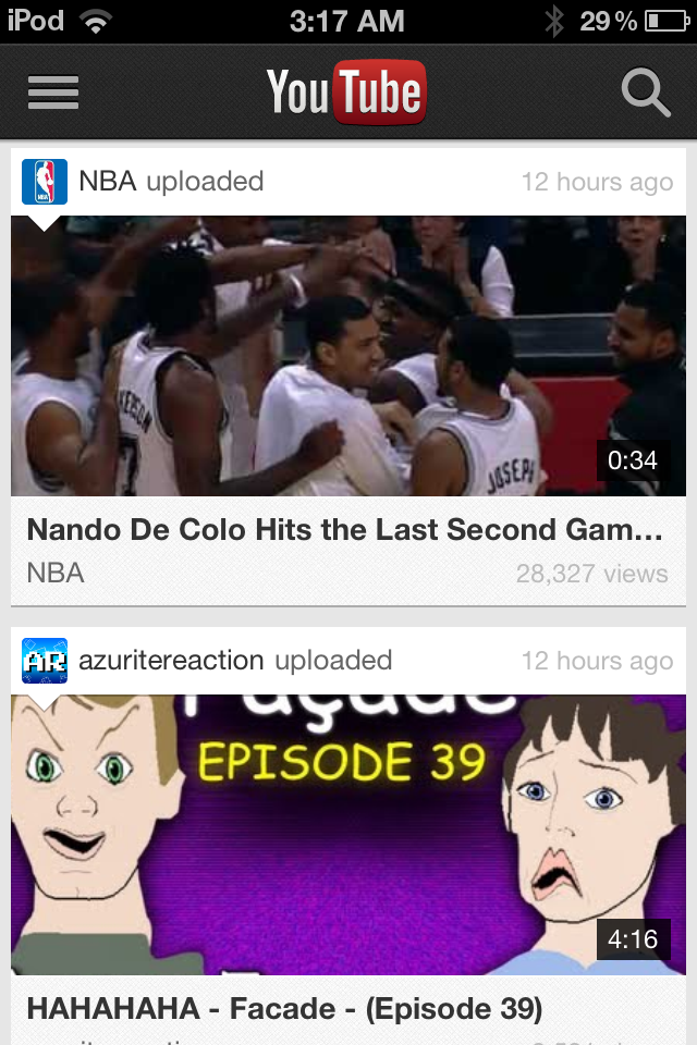
After signing in with your Google account, you'll see typical Google. Very minimalistic, with a simple list of videos from your subscription box which sport huge icons along with a search button and sidebar. That's pretty much all there is. When watching a video, you can now view a video while reading the comments or description. Turning your device automatically hides the description and puts you in full screen mode. It works pretty much exactly how you expect, and in this regard, Google has done a great job.

New YouTube App Subscriptions
Old YouTube App Subscriptions
New YouTube App Video
Old YouTube App Video (Hint: You can't
watch a video and read the
description at the same time


Performance

One thing that really bothered me to no end with Apple's Youtube app was that no matter how bad my connection speed was (and it's notoriously bad in my area), it insisted on playing the high quality video wherever possible. This meant that I couldn't watch a video without it constantly buffering, frustrating me to the point of giving up. Thankfully, Google's new YouTube app knows better than to download more than it can handle, and uses standard quality whenever connection speeds are slow.

Long way to go

Unfortunately, after the first few weeks, letting the excitement of the new app settle down, I've come to realize that all that praise ends there. Google has a long way to go with their YouTube app to be really killer. What about annotations? Back in 2007 when the original YouTube app was made, there were no annotations, and its understandable that they were never included back then. But there are a lot of YouTubers nowadays who make really high quality videos now and many like to include links in their videos for easy access. To those on mobile devices, there's absolutely no ways of seeing annotations. It's really a major let down for the YouTube addicted like myself.

Usability could also be improved as well. Categories are stored underneath subscriptions in the side bar. That's a huge mind blank by Google. What if I have 300 subscriptions? I'm going to scroll forever every time I want to choose a category. And those video icons. I initially thought I'd like the size, but they take up literally half the screen. That's not really surprising, because their desktop YouTube page is notorious for being very unorganized.

Conclusion

Don't confuse the fact that I spent half this review ranting about the new YouTube app. It works just fine and watching YouTube videos works just perfectly. It's just that YouTube has been around for the entire life of the iPhone, it's a little frustrating that their isn't a way of watching YouTube videos on a mobile device that feels like a pleasurable experience. But it's exactly what you expect, and it's definitely hands down better than Apple's five year old app. But personally, I'm going to stick with the mobile web app.

Wednesday, 10 October 2012

Chrome for iOS Review

Earlier this year, Google Chrome for the desktop recently took over Internet Explorer the most used web browser of all time, a huge feat. Since then, they have released Chrome for Android, and even more recently Chrome for iOS. But how does it stack up to Apple's own and stock web browser, Safari.

How does it look?

Upon installing Chrome, just like any other app (right from the app store), you'll be presented with a page to sign in to your Google account. The interface consists only of a single bar along the top with a back button, a settings button and a button to see all your open tabs. Finally, the desktop's famous omnibar makes an appearance here as well. And basically, that's all there is. It's incredibly clean and offers more screen real estate than Safari.

The sign in page

Tab switching
One thing that's definitely noticeable is the way Google has implemented tab switching. When you press the tab button, you can swipe up and dwn through all your open tabs. To close a tab, you swipe the tab left or right and the tab is swept off the screen. It's pretty neat and funnily enough, pretty satisfying.


New tab page
The new tab page is also very neat. It's just like you would expect. Like the desktop version, but shrunk down. Swipe all the way to the left, and you can see your six most visited pages, in the middle is your favourites and swipe all the way to the right and you can see your open tabs across all your machines.

Performance

To date, Chrome for iOS has been very stable and snappy. In personal experience, the performance seems almost on par with Safari. While benchmarks may prove otherwise, they're not always a good measure of real world performance. The bottom line is, Chrome is solid, and you won't really notice and significant speed differences to Safari (and if you did, you probably wouldn't want to be surfing the web on a phone in the first place).

Syncing

Hands down the number one reason why you probably want to use Chrome is for syncing. Like we said before, statistics say that you are probably reading this post from Google Chrome for the desktop and if you are, you've probably set up sync and keep your bookmarks and passwords synced across all your computers. No mobile browser, Safari included, has offered a simple way to import bookmarks from my desktop web browser, let alone passwords, auto-fill, search history, settings, web apps etc. Not only was I able to have access to all my bookmarks with seconds of my first run of Chrome, but I could even see what web pages I have open on my other machines. The desktop version can even send pages to my mobile device right from the omnibar. If there's one thing Google has consistently got right, it's syncing and Chrome for iOS does not disappoint.

See web pages from all your devices

The Catch

Chrome has been a far superior experience than Safari in almost every category. So at this point, maybe you might be feeling just as I did. "Throw away your Safari, Apple. I have Chrome now." Well, unless you have jailbroken your iDevice (as I have, but realize most people won't), Apple doesn't give you a way of changing your default browser. That means all external links, even bookmarks create on your springboard, will open in Safari. It's a shame, because the only thing that would keep me from using Chrome is that fact that I can't set it as the default browser. Lame!

Conclusion

Since the very day Chrome came out for iOS, I have been using it and can't recall even one time that I open Safari that wasn't by accident. I have not had a single reason for wanting to open Safari. It's just been that solid. The only disappointment I have experienced is not even Google's fault, so it's hard not to recommend Chrome for iOS.

9.5/10

Monday, 1 October 2012

iOS6 Maps: they're not THAT bad

For quite some time now, I've been using iOS6; over all, it's a slight improvement on iOS5. It's not a big change, but there are a few new features I've come to use everyday. It's fast, looks great on iPhone 5 and certainly makes a great mobile operating system. 

But, there's one thing about it that everyone is talking about more than everything else:

Maps

It's interesting that Maps on mobile devices has become one of the most important features of any phone. Even more interesting is the fact that including Maps on the first iPhone was a last-minute decision (http://9to5mac.com/2012/09/28/including-maps-on-the-original-iphone-was-a-last-minute-decision/). 

Apple's new maps are iOS6 exclusive, and offer some new features that haven't been seen on iOS before: namely, turn-by-turn navigation, flyover, and Yelp integration. 

These maps excel where most maps don't: they look great! Unfortunately, where maps need to excel - accuracy, and reliability - Apple fails: sometimes tremendously. The use of vector based graphics make imagery fast, pleasant to look at, and they consume far less data than other mapping services. However, accuracy leaves a lot to be desired. Some people have noted that their home is in the middle of a river, or their closest cafe is in New York (for someone living in Sydney, it's not that useful). Something adding irony to the arena of criticism is the location of Apple's flagship Sydney store:
The apparent location ofApple's Sydney Store (the purple pin is the actual location)
Flyover
I've spent a lot of time visiting many cities around the world with Flyover. It's obvious that Apple has spent a lot of time and effort on these 3D maps of hundreds of cities around the world. Here's a few good screenshots:


CBD, Sydney
Empire State Building, New York
Houses of Parliament, London 
CBD, Sydney
One that isn't so great:
Western Distributor, Sydney

Turn-byTurn Navigation
It has been reported that the reason Apple ditched Google Maps was that Google refused to make turn-by-turn navigation available to Apple. Apple's version seems to work well. Other than directing me down the wrong way of a one-way street, I haven't had any problems with it.
Directions from Sydney to Chatswood.
Yelp Integration
It's nice to see local businesses on these maps, and their contact cards flow nicely; providing reviews, photos, and contact methods, all unified into one place. 
A contact card for a local cafe
Conclusion 
In the end, Apple has made a genuine attempt to make a beautiful, accurate mapping service, in some cases, they succeed; in others, they don't. 

Personally, I think that for a first attempt, Apple has done an authentic job. With a lot of work and effort, Apple can once again call these maps the most beautiful, powerful mapping service ever.


Before and after the Maps disaster


Tuesday, 25 September 2012

5 Days With iPhone 5

Hi everyone, Jack here;

Today marks my fifth day with Apple's newest product to hit the market. Personally, I think five days is more than enough time to make my assumptions and decide if those hours waiting in line were worth it or not. 

Apple's new iPhone 5 in black & slate and white & silver (image credit: Apple.com)

So firstly, some history. For the three years leading up to Friday the 21st of September 2012, I had been using an iPhone 3GS. It had done me very well for those three years: but I was well overdue for an upgrade. The front and back panels were falling apart, the battery rarely lasted more than two hours, it took almost a minute to open Safari (or any app, for that matter), the screen was overwhelmingly scratched, and the camera could barely make out the silhouette of an office tower... But amazingly, it still worked!

Understandably, after the setup process with my new iPhone, I was pleasantly relieved when I could use Safari in less than a second. And I use 'pleasantly' as a big understatement.

I'll give the iPhone 5 a rating out of 10 for the following key aspects; setup, display, battery, speed, and software

On with the show:

Setup: 10/10
There's been a lot of people complaining about iCloud and it's myriad of problems: I didn't encounter any. It was as easy as signing in to my Apple ID and tapping 'Backup from iCloud.' It was all done. All my photos, contacts, messages, apps, settings... Everything was just there. 


All your content and settings from a previous iPhone are restored to your new iPhone in these two screens (image credit: About.com)

Display: 9/10
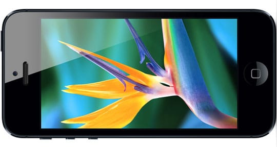
I was amazed with this display, it really looks like the icons are sitting on top of the screen, rather than under it. There's really nothing more to say other than 'wow.' Now, again, I have been witheld from the retina display for the past three years, so perhaps my analysis of this aspect of iPhone 5 is biased; but if you take away something we're all used to now, you'd really notice the difference. After comparing this screen to my 3GS, there really was no competition. 
Apple's Retina Display offers clear, sharp, and precise image and resolutions (image credit: RS Web Solutions)

Battery: 6/10
Unfortunately, I believe the battery is the ultimate downfall of iPhone 5. LTE and all the different system services definitely drain this battery. I can just manage a day on the battery; by the time I go to bed, it's at 5%. 
The battery (I believe) is the ultimate drawback of iPhone 5 (image credit: ultrasn0w.ca)

Speed: 9/10
Just like the display, I am partially biased with this component of iPhone 5; however, even when comparing 5 to 4S, it's possible to feel how much faster it is. LTE is astonishingly fast, so much so that I found myself complaining about the slow network when LTE was unavailable in my location and it fell back to 3G.
LTE (Long Term Evolution) offers super-fast cellular networking with (theoretical) speeds up to 40Mbps (image credit: GottaBeMobile)

Software: 7/10
iOS has proven to be one of Apple's major successes. Released in 2007, it's proven to outperform many other mobile OSs: until recently. It's been over 5 years, and the aesthetics have remained largely unchanged. It's still the same grid of icons (albeit with another row added) and the system apps are the same as they were in 2007. Personally, I think iOS is beginning to show it's age. Other than aging, it's a great OS, the App Store is really the pulling point of iOS and without that, I think it's unlikely that iOS would still be as popular as it is. 
Apple's iOS 6 is available for iPhone, iPad, and iPod touch (image credit: Engadget)


Overall score: 41/50 or 82%

So, to answer the ultimate question: yes, I think it was worth waiting in line for hours to get my hands on one. But Apple had best make the iPhone 6 one amazing phone for me to do it again.

BONUS: iPhone 5's new trailer by Apple: