
| Windows 8: the new logo |
Microsoft is putting the finishing touches on their 8th edition of the market-dominating Windows operating system. Although, this is arguably one of the most drastic overhauls of the operating system since first launch in the mid-90s. Microsoft is gearing Windows more towards touch screen devices - tablets, phones, touchscreen PCs - and the changes as a result of this are quite profound.
Live Tiles are definitely a useful and intuitive tool with the countless notifications that one gets on a daily basis. The idea behind them its that each app has it's own tile, which displays the current status of that particular app. For example: the Facebook app would display the number of new messages, notifications, and friend requests on the tile itself, without the user having to open the app. Good idea, sure. But many have questioned Metro's (as Microsoft has colloquially called it) ability to successfully transfer over to the personal computer. I'll talk more about that later.
 |
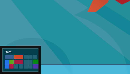
| Windows 8 Start Screen: replacing the Start Menu |
The Start Screen is essentially a collection of live tiles, offering notifications from many different apps all in one place, much like Notification Centre in Apple's iOS and OS X. Microsoft has taken a very different approach to this, however. Rather than having a Start Menu, or Launchpad (like previous editions of Windows and current OS X versions), Microsoft has made the Notification Centre the only place to access applications, and other features that are part of the computer. Personally, I think this is a fantastic idea. Unfortunately, rather than only making this available for those using tablets, Microsoft has pushed this rather intuitive feature on to everyone using Windows 8. Not a bad idea, you might ask? Perhaps. However, with devices without touch screens (or 90% of the personal computer market (when I say computer, I mean notebook and desktop PCs, not iPads and tablets)), this installation does not work as one would desire.
 |
| The Hot Corner to open the Start Screen |
The Hot Corner-esque aspects of the OS make it difficult for users with keyboards and mice to navigate the system, with no constant markings on the screen as to how to get to the Start Screen, the user becomes confused, frustrated, and immediately dislikes the change. On tablets, it's a completely different story, with the user swiping from any side of the screen to get to these features, it definitely makes the OS seem responsive and like it was actually designed for touch screens. Which it was. It's just that the (forced) transition for notebook and desktop users seems like they've been given a unfinished and inadequate experience.
 |
| Windows 8 Application Store |
The Microsoft Application Store is a long overdue addition to Windows 8. Gone are the days where users had to search the internet for what they wanted, only to find thousands of matches, most of which was malware. The Application Store currently has about 4000 apps (that's before the actual launch of Windows 8). It's very similar to Apple's OS X App Store; every app needs to be verified by Microsoft, to ensure it has only good intent. Updates are easy, fast, and quite regular.
Overall, Windows 8 is a wonder on tablets and other all-touchscreen devices. It's use on notebooks and desktops seems rather lacklustre and poorly implemented. Having said that, only the launch, sales figures and user satisfaction numbers can prove that point. It will be just as interesting to see the success of the Microsoft Surface. Without any solid reviews to base any critique this device on, it's made to look like it's the most amazing thing since the advent of the internet, which is exactly what Microsoft wants us to think. Having said that, it sure does look nice.
 |
| Microsoft's new tablet, dubbed the Microsoft Surface |
No comments:
Post a Comment